Apple Watch Series 3
An Ongoing Review
In September 2014, Apple announced the first Apple Watch at an event in Cupertino. I was in the audience and I still remember my first thought: "It looks like the Sony Smartwatch!" I had imagined the iWatch to be more minimal, bolder and somewhat different.
Looking back that first thought still amuses me. The Apple Watch really looked a little like the Sony Smartwatch. But who remembers the Sony Smartwatch now?
After the announcement, I reviewed the first Apple Watch for the Swiss newspaper I work for. I liked it as a watch. I didn't like it as a computer for the wrist. Too many functions were missing and it was slow and clumsy to use.
The best things about it were the watch faces, the watch bands, all the tiny watchmaking details only a few people notice, and of course Apples ambition. While other companies released a few versions at best Apple launched a whole collection. That was a bold move. Maybe even a little too bold for a first generation device.
Now three years later I wear the third generation model on my wrist. It has all the functions I missed back in 2014. Everything I didn't like back then has very much improved. Everything I liked is even better now. But let's get into the details!
watchOS 4
Someone at Apple once told me, when asked about the upgrade cycle for the watch, that there was so much they could do with software, that older models are still going to be fine when the next generation arrives. That turned out to be true. With watchOS 3 the first generation Apple Watches got so much better and faster. WatchOS 4 does that again. Everything gets faster and easier to use.
One of the biggest improvements is the new dock. Now ist vertical and so much more intuitive to use. You can even scroll with the crown. Among the smaller improvements is the new activity coaching, the firework animations when you close an activity ring or the more useful heart rate app. But three improvements are so big they deserve their own section:
Kaleidoscope Watch Face
Since the release of the first Apple, Watch people were asking to get the opportunity to design their own watch faces. Competitors have allowed this for years. With watchOS 4 Apple has found an elegant compromise. The Kaleidoscope watch face turns photos and drawings into fascinating watch faces. You wouldn't believe how much time I already invested into finding the best pictures for the new feature. I recommend using photos and drawings with a lot of black and bold colors.
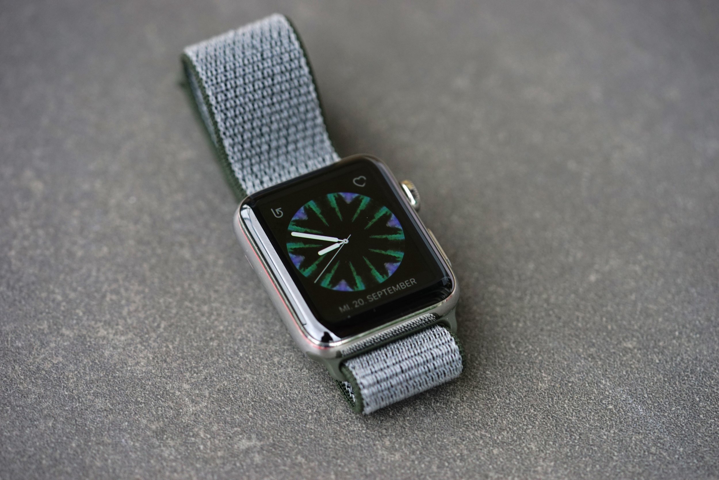
The smart thing about these new watch faces is they work like a spirograph. Even people with zero talent can create something nice with it. At the moment I have four different Kaleidoscopes watch faces on my watch. They fit different bands and different moods. I know this is only something watch nerds will get but it's my favorite feature of watchOS 4. Lovely detail: If you have two Apple Watches the Kaleidoscope watch faces are perfectly in sync.
Music Watch Face
Whenever I had to explain how the Apple Watch is still too complicated to use I showed the many touches it needed to pause Spotify. Now with watchOS 4 the Apple Watch automatically displays a special watch face for audio controls whenever you're listening to music or podcasts. With one touch you can skip a song. With the crown, you can adjust the volume without even looking at the watch. The whole feature is a very good example of how well iPhone, Apple Watch, and Airpods work together. Apple no doubt calls this magical. But to be honest it really is.
The Flashlight
The smartphone completely replaced the flashlight in my life. But since I don't take the smartphone into my bedroom I started using the Apple Watch (which I wear at night) as a flashlight by activating the screen. Now Apple launches this as a real feature. You get white, blinking white (for jogging in the fog or at night) and red. It's really handy and I already used it a lot since installing the first developer beta in summer.
The new Processor
It's about time that we start talking about hardware. The new S3 chip promises up to 70% more speed. These numbers usually don't mean much. But you can really feel the difference between a Series 2 and Series 3 Apple Watch. Using the new watch is so much more fluent and reliable. Apps that haven't been placed in the dock still need a few seconds to open. But even that's an improvement.
With the new S3, it's easier, more reliable and nearly stutter-free to switch watch faces, to open notifications or to scroll through lists. Even under the shower, it's easier to use the touchscreen with wet fingers. Though I'm not completely sure how much of this is due to new hardware and how much it has to do with the fact that my review unit is an aluminum watch without the sapphire glass I'm used to. But Twitter user tell me they noticed the same improvement coming from an aluminum Series 2.
Update: I‘ve since checked with different models and it really is an improvement of the Series 3 and has nothing to do with sapphire vs. normal glass. The new hardware and chips seem to be much better at separating fingers from water drops on the screen. Now you can use the watch in the tub or in the shower.
Overall the new chip is a big improvement and dearly needed. On the wrist, you don't want to wait. Everything has to work instantly. Or can you imagine using a nice chronograph like a Speedmaster, an Autavia, or a Daytona and having to wait a few seconds before the stopwatch starts running? In this regard, the Apple Watch still has a long way to go. But the S3 is a big step in the right direction. The ultimate goal has to be an Apple Watch that's so reliable you can use it without looking at it.
The Barometric Altimeter
With the Series 2, there was a big surprise when iFixit found a barometer sensor inside. With Series 3 the Apple Watch not only get's a barometer it can also use it. Now the Apple Watch knows if you're walking up or down a hill and calculate calories accordingly. With earlier versions, the watch needed the iPhone for that task. Since developers can get access to the barometer expect some new altimeter and weather apps for the Apple Watch in the near future. But don't expect Apple to reactivate the barometer on the Apple Watch Series 2.
Cellular
The most important new feature isn't ready in Switzerland. Apple started selling the cellular model but our telecom companys aren't ready yet. They promise to be ready later this year. Regarding the bug that plagued the Apple Watch reviews of the Wallstreet Journal and The Verge, I don't mind waiting a few more weeks. I'll update this review as soon as my provider turns the LTE-feature on. Despite the Swiss delay and the bug I still like the idea of a cellular Apple Watch very much and can't wait to try it out. By the way, I was quite surprised that Apple actually announced cellular this year already. It has always been my impression that Apple isn't in a hurry. They rushed the first Apple Watch so they surely wouldn't rush such an important feature.
Update: The local telecom providers have finally launched LTE for the watch in late 2017. I‘ve been using it ever since and I love it. It allows me to go on a photo walk without my phone or to go pick up our kid at daycare without bringing the iPhone along. I can even call my wife to let her know that we‘re on our way home. Do I really need it? No. Will I pay for it once my free trial ends in autumn? I haven‘t decided yet. But maybe Apple forces my hand by making sure with watchOS 5 that all apps and services work independently over LTE.
The Red Dot
I like the idea of a cellular a lot but why did Apple put a red dot on the crown of every cellular model? It looks like the record button on a video camera or the famous red dot on Leica cameras. It's neither subtle nor friendly. It literally screams at you: "Look I have a cellular and therefore more expensive Apple Wach!" Compared to the-the red dot even the Rolex cyclops is subtle. The only good thing about the red dot is you don't see it a lot. But everyone else will no doubt notice it. Let's hope Apple reconsiders and removes the showy red dot from future watches. The digital crown is statement and signature enough.
Battery
Since I couldn't try cellular on my review unit I have only very good things to report about battery live. I've been wearing mine now for more than 36 hours and I'm still at 37%. If you don't overuse it the new Apple Watch might last you two days. Personally, I charge more often. Once in the evening before going to bed and once in the morning while in the shower. That allows me to wear the watch at night and use it for sleep tracking and as a silent alarm (highly recommended!). Would I like better battery life? Of course. But I'm happy the way it is for now.
Watch Bands
Apple once again released a whole collection of new watch bands. I like the Leather Loop in Cosmos Blue and the Classic Buckle in Cosmos Blue and Dark Aubergine. But my favorite is the Bordeaux Swift Leather Single Tour by Hermès.
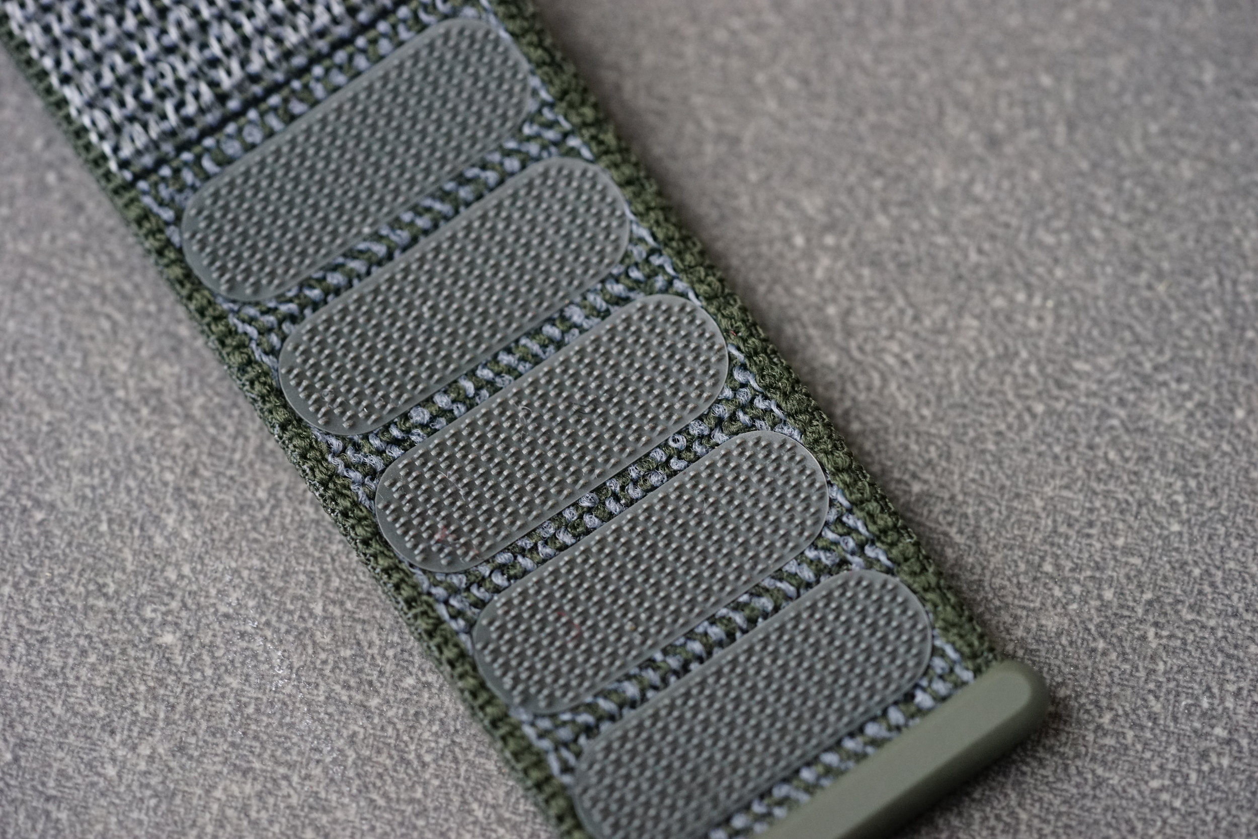
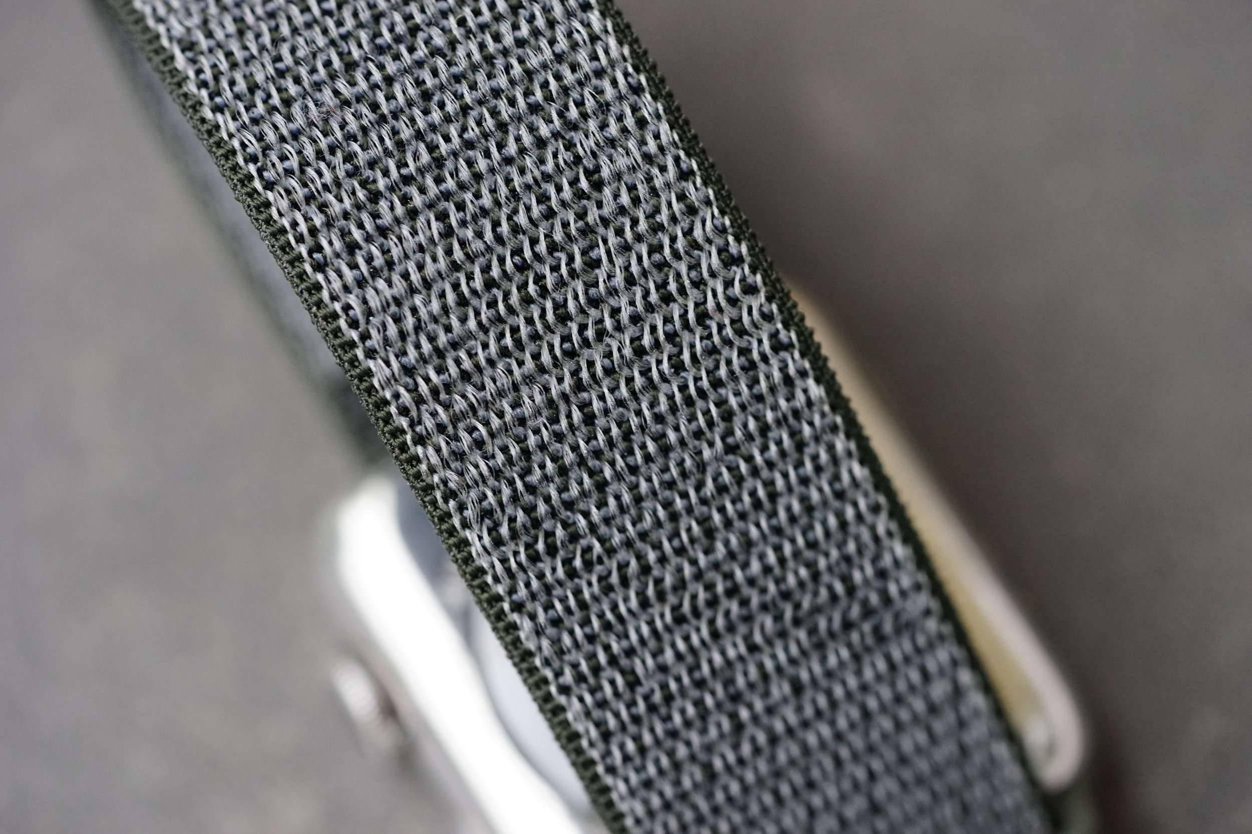
But Apple also released a completely new type of watch band. The Sport Loop is made of Velcro like breathable nylon weave and looks and feels a lot like the NATO straps watch nerds like me love. It's super comfortable on the wrist. But since the look is rather sporty I wouldn't wear it on formal occasions.
What is missing?
I'm still waiting for Apple to do sleep tracking. At the moment I use a third party app. I don't like the idea of sending such sensitive data to a company I don't know. I still hope Apple will do sleep tracking in the next version of watchOS. It's such central element in health tracking they can't afford to miss this opportunity. Even my old Fitbit could do it.
I'm still hoping for some kind of an always on display. The competition already has it. But it never looks very nice. That's probably why Apple is waiting. I really want to check the time with a glance and without moving my wrist. If I want to check the time I nearly always glance at my other wrist with a mechanical watch. Yes, I wear two watches. The Apple Watch doesn't replace my mechanical watches. It complements it.
Talking about the display I would love to have a night mode. In direct sunlight, the bright screen is very handy. At night it's way too bright. Whenever I go to bed I activate Do Not Disturb and Theatre Mode. The Apple Watch should do that automatically and dim the screen.
I also hope for some kind of gesture control. It happens at least once a day: The Apple Watch displays a notification but I can't open it because my other hand is occupied with carrying an umbrella for example. Wouldn't it be cool to be able to turn your wrist twice to open notifications? Some kind of finger tracking with radar-like Googles Project Soli would be even cooler. But that's still a few years in the future. But it might eventually end up in watches as the Android Wear boss recently hinted at in an interview with me. Can't wait.
Finally, I would really like for the Apple Watch to become completely independent from an iPhone so you could even use it with an Android phone. I think that would be great. I doubt though that Apple likes that idea as much as I do. But what about the iPad? Wouldn't it at least be great if the Apple Watch could use the LTE of the iPad? Just like it does now with the iPhone. Having an iPad in your backpack could replace the need for a connected smartphone.
Conclusion
The Apple Watch is now an iPod and an iPhone. It's impressive how much technology Apple can fit into such a small device. Using the Apple Watch has become significantly easier with the new hardware. Thanks to the Apple Watch I waste less and less time on my phone with notifications and apps. It allows me to only pick up the iPhone when I really want to. Too bad the cellular version isn't ready in Switzerland yet. So I'll have to reserve my final judgment for a later day. Cellular has the potential to make the watch so much more useful. The good thing about the delay: Apple has time to fix some bugs.
What does the new Apple Watch mean for the whole industry? While other companies scale back their smartphone business and let traditional watch companies pick up the pieces Apple steams ahead and defends its leadership position. Similar to the iPad business it's getting harder and harder for competitors to catch up. The biggest risk for Apple is that another company does for the smartwatch industry what the iPhone did for smartphones. If someone could really reinvent the smartwatch and make it so much more powerful and so much easier to use that would really turn everything upside down.
This article was first published in the Swiss newspaper Tages-Anzeiger. Rafael will keep updating this article with new things he discovers.


